Our Amazing Fighters
UX Design | UI Design
.png)
This is an industry project as a part of the HCI 580: UX Design Practicum course. The goal was to work with real clients, choose and practice appropriate methods learned in the HCI foundational courses to address business goals and user needs.
I was the team lead for this group project that consisted of 6 students with different skill sets. I worked as a UX Designer and helped in implementing the user-centered design process.
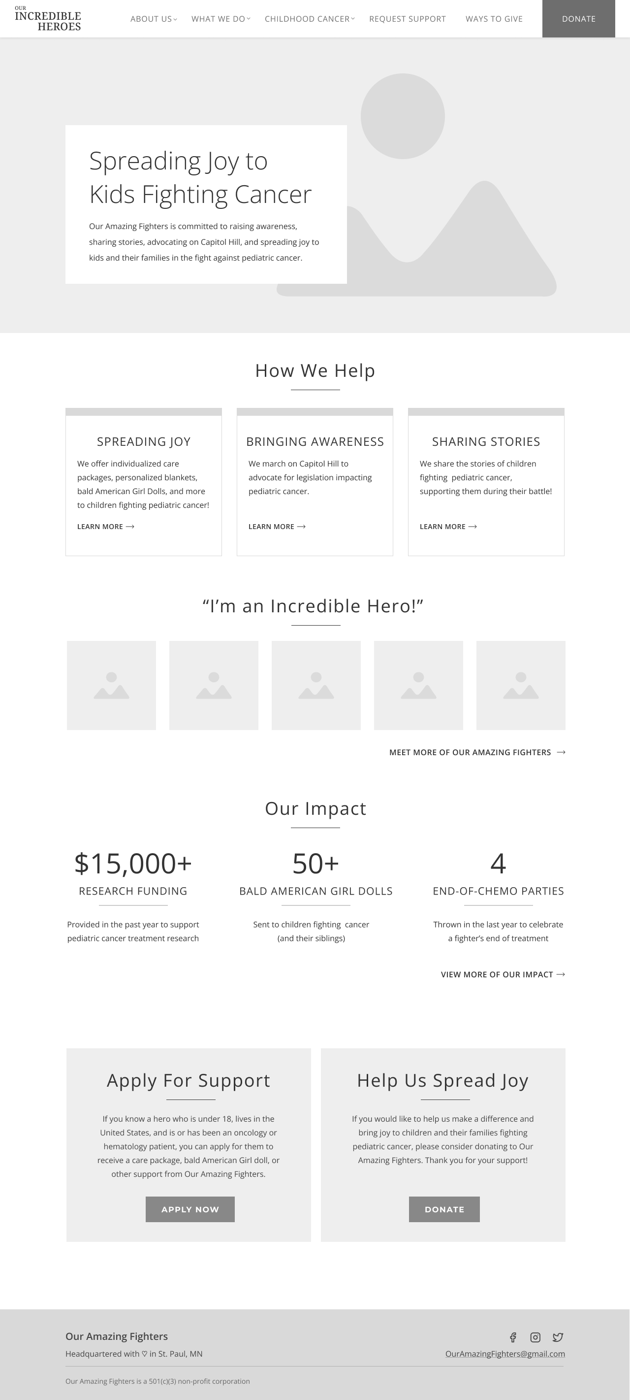
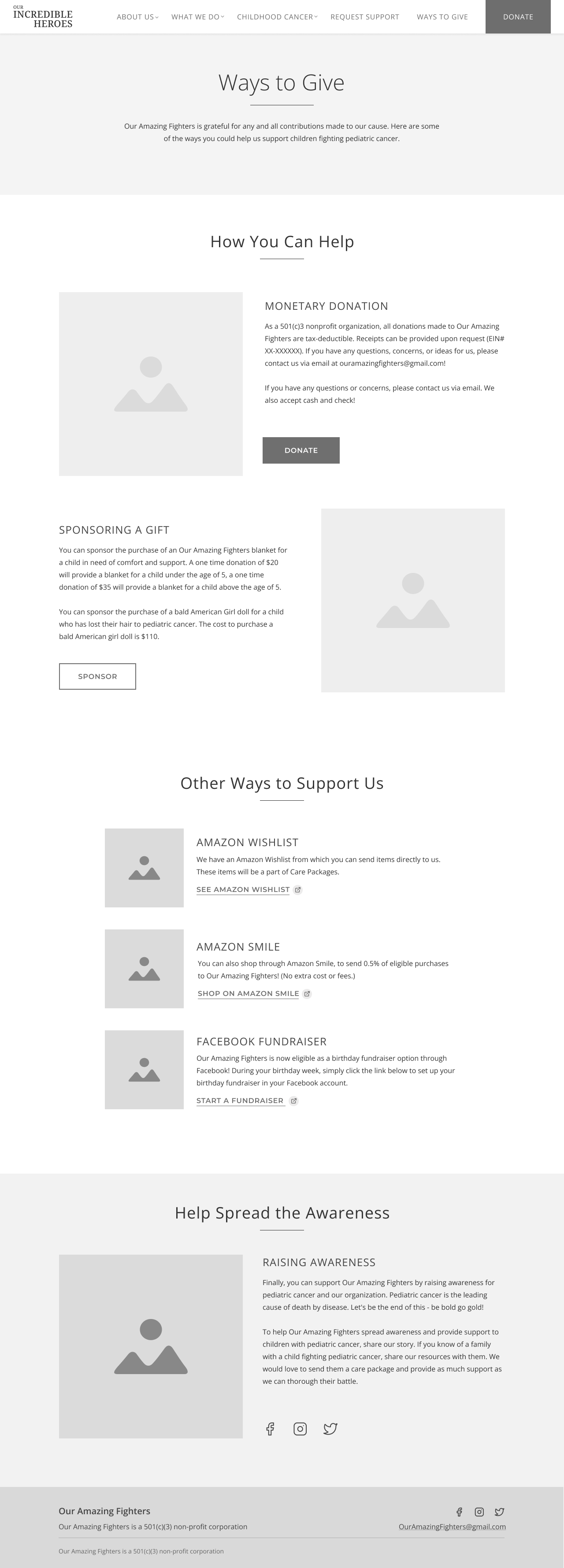
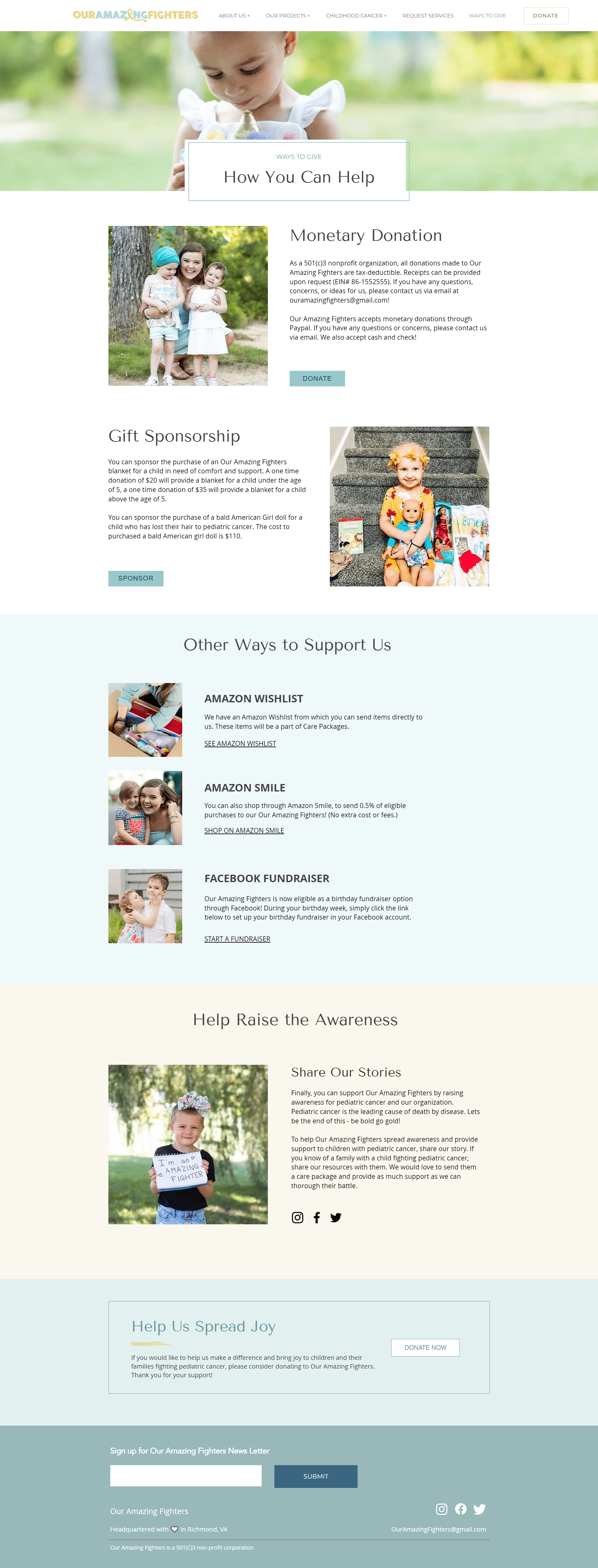
Our Amazing Fighters is a pediatric cancer non-profit, based in Richmond, VA. Their founder, LeAnna Headley, began the organization through her Instagram page in 2014, by sharing the stories of children battling cancer.Since 2014, Our Amazing Fighter's has grown into a 501(c)3 non-profit organization, supporting children and their families by providing customized care packages, personalized bald American Girl dolls, local Richmond area support, as well as through advocacy work on Capitol Hill.
Stakeholders Are Struggling to Keep Up With Demand; Users Are Struggling to Complete Desired Tasks
As Our Amazing Fighters expands their services, they are looking for a way to revamp their website to fit their growing needs. They are struggling to manage and organize the applications they receive from families in need, as well as to quickly and easily process donations. In addition to this, their users are finding it difficult to apply for services, stay up to date on the status of their applications, and to submit donations within the website.
How might we create a seamless experience for the families requesting services from and donating to Our Amazing Fighters?
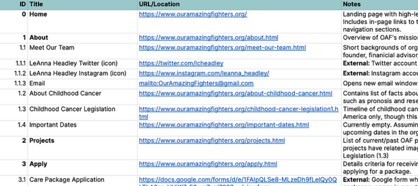
To understand issues at hand, we completed a heuristic evaluation paired with conducting a thorough content inventory.
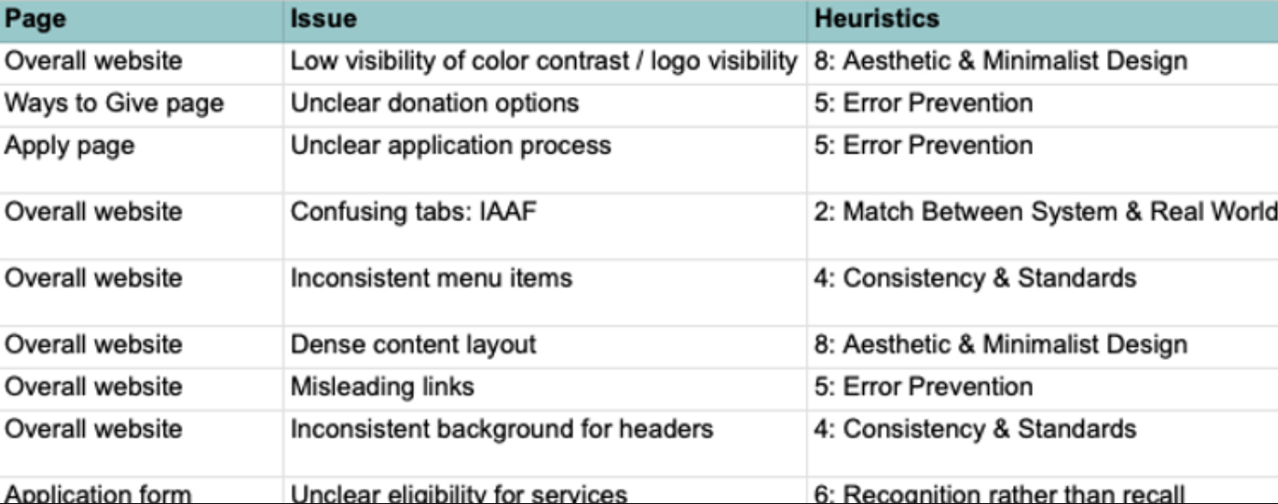
High Priority Issues:
Users Desired Simple Ways to Apply For Support and Donate
By interviewing families who had previously used the website, we gathered valuable insights into their expectations and frustrations with Our Amazing Fighters.
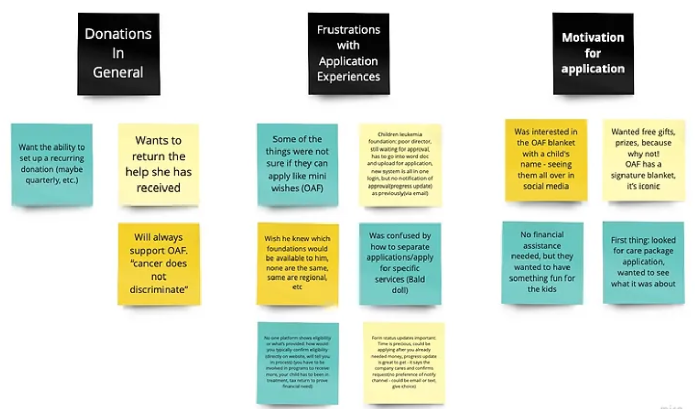
User Pain Points
With these insights, we created a user persona to help center user needs.
.png)
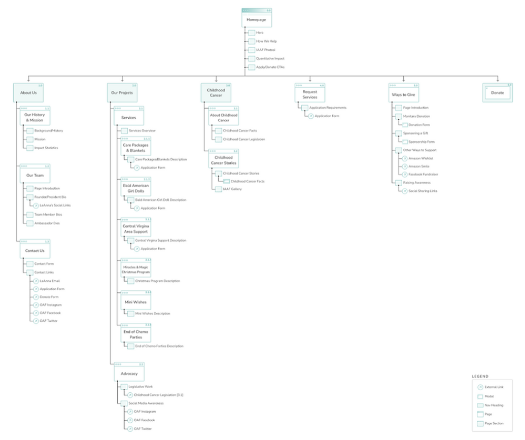
IA was improved through clear Content Organization and Labels
To address the website's unclear information architecture, we focused on restructuring content and labels for all pages, including main menu navigation items.
We conducted an open card sort to understand user preferences, followed by a closed card sort to validate the newly defined architecture.
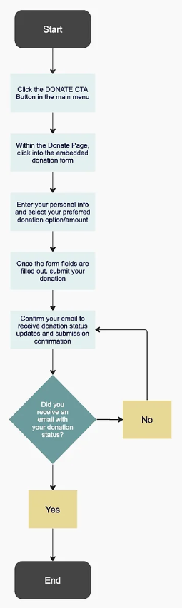
User pathways were improved using direct CTAs and Embedded forms
To address the indirect pathways for service applications and donations, we documented user complaints and proposed design solutions for each process. Subsequently, we developed suggested updated user flows for each pathway.
Donation Pathway
❌There is not a clear and direct pathway to donate
✅Simplify path to donate through clear Call To Action (CTA) buttons
❌Users are required to leave the website to make a donation
✅Embed the donation form within the website
❌Recurring donation options are not available
✅Design embedded form to allow for recurring or one time donations
Application Pathway
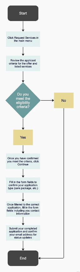
❌Users are confused around eligibility for services and are unsure of which application to fill out for their desired service
✅Offer listed eligibility requirements before and within the application - screen users responses to direct them to their desired application
❌Users do not receive updates regarding their application status
✅Send users automatic email status updates as their application processes
❌Users are required to leave website to fill out an application
✅Design embedded form to allow for applications within the website
Users Found The Updated Information Architecture Easy to Navigate
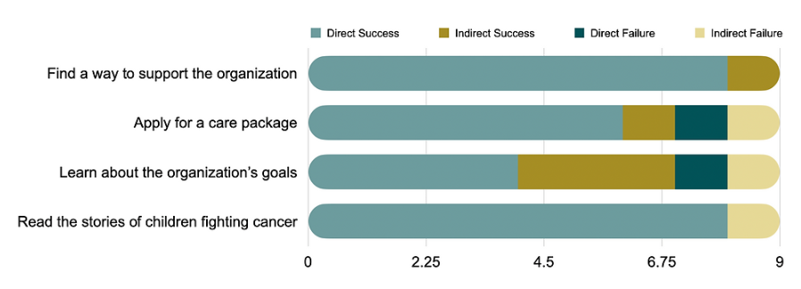
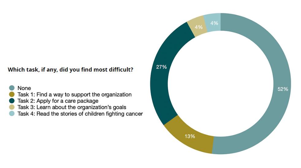
We conducted tree testing surrounding page navigation, content organization, and user pathways to confirm the restructured information architecture and user pathways. Using four outlined tasks, we directed participants to navigate through the updated architecture
Mid-Fidelity Iterations Incorporated Our Updated Information Architecture
With our validated information architecture, we jumped into several prototyping sprints. With our stakeholders looking to launch the product as soon as possible, we transitioned from sketching to mid-fi prototypes.
https://www.figma.com/file/SJWTA2AvcOrmx8UTWonpY3/OAF-Mid-fi-Prototypes?node-id=0%3A1
The prototype successfully led participants through user task flows
To validate the mid-fi prototype, our usability testing focused on user pathway success for applications and donations, navigation, and overall content organization.
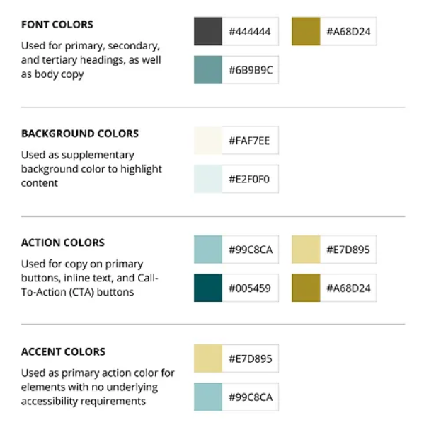
Our UI kit and logo redesign incorporated accessibility
While our stakeholders desired to remain true to the organizations original color palette, updates regarding accessibility were required.
As the visual design remains consistent with Our Amazing Fighters' unique branding, preserving the organization's originality, the color palette has been updated to meet accessibility standards and comply with the WCAG AA rating.
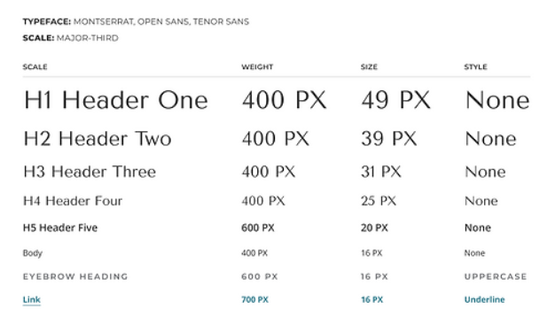
Updated typography consists of three font types: Monsterrat, Open Sans, and Tenor Sans, showcased within a major-third scale.
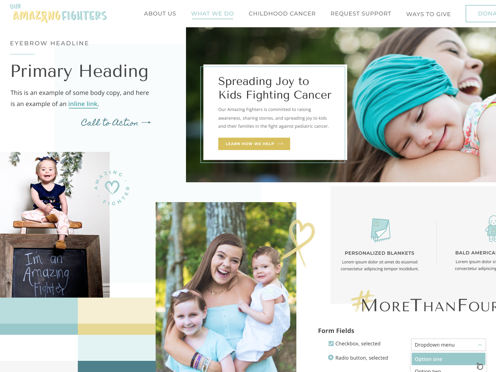
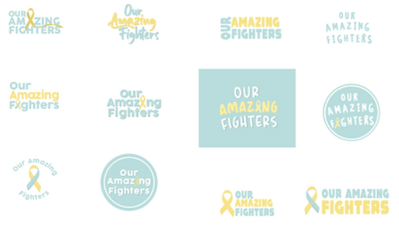
When redesigning the logo, we focused on improving accessibility through updated font style and color palette, while staying true to our stakeholders' vision for the organization (warm, friendly, and inviting).
Logo Iteration
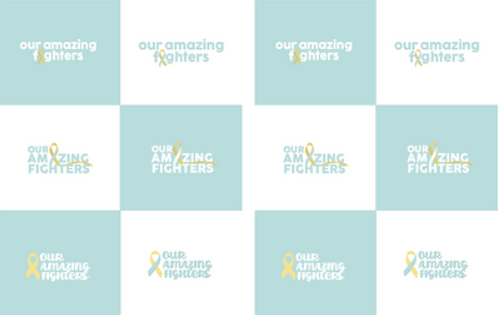
Final Iteration
.png)
The final design offered solutions that aid both stakeholders and users
The final iteration integrated the completed visual design from our UI kit, along with validated information architecture, content organization, and user pathways for donations and service applications.
You can now view the full redesign by visiting Our Amazing Fighters @ OurAmazingFighters.Org
I have been honored to work with Our Amazing Fighters - I am proud to assist to an organization that does so much to help those in the fight against pediatric cancer.


Future Opportunities
Designing a mobile application that would help users find friends, make groups and share experiences.
Creating a Design System that would help LeAnna (client) easily make changes and updates to the website.
Challenges
Spent a lot of time on user interviews, as recruiting participants was challenging due to the sensitive subject at hand.
Learnings
Preemptively tackle team schedules, so as to streamline meeting times and increase productivity
.png)